|
I came across this post from Jay Kumar's BassBlaster with Great Lakes Finesse's Dan Miguel talkin' about how for clear-water pressured smallmouth bass, guys like to use bait colors that blend in with the water.
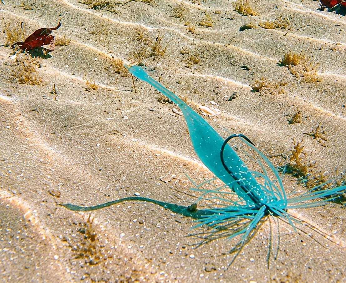
GLF just came out with that sick-looking 'spicy melon' color (above) that blends in with the clear water Dan fishes on the Great Lakes. Real quick, here's what he said about it:
> "...we wanted a color that blended in up north in the clear water. When the sun hits the water, there's an ocean-like green turquoise hue to the water. Basically we wanted a color to blend in to that environment to make those fish feel like they found the bait.
> "...the colors that match their surroundings seem to produce the most and biggest fish consistently.
> "I'm a firm believer that you want the fish to feel like they found the bait rather than make the bait be so obvious to the fish. I think sometimes you make the bait too obvious to the fish and that turns them off.
> "Especially the bigger pressured fish. They want to feel like, Ah I see you, I got you."
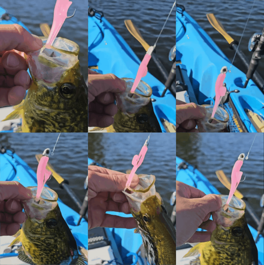
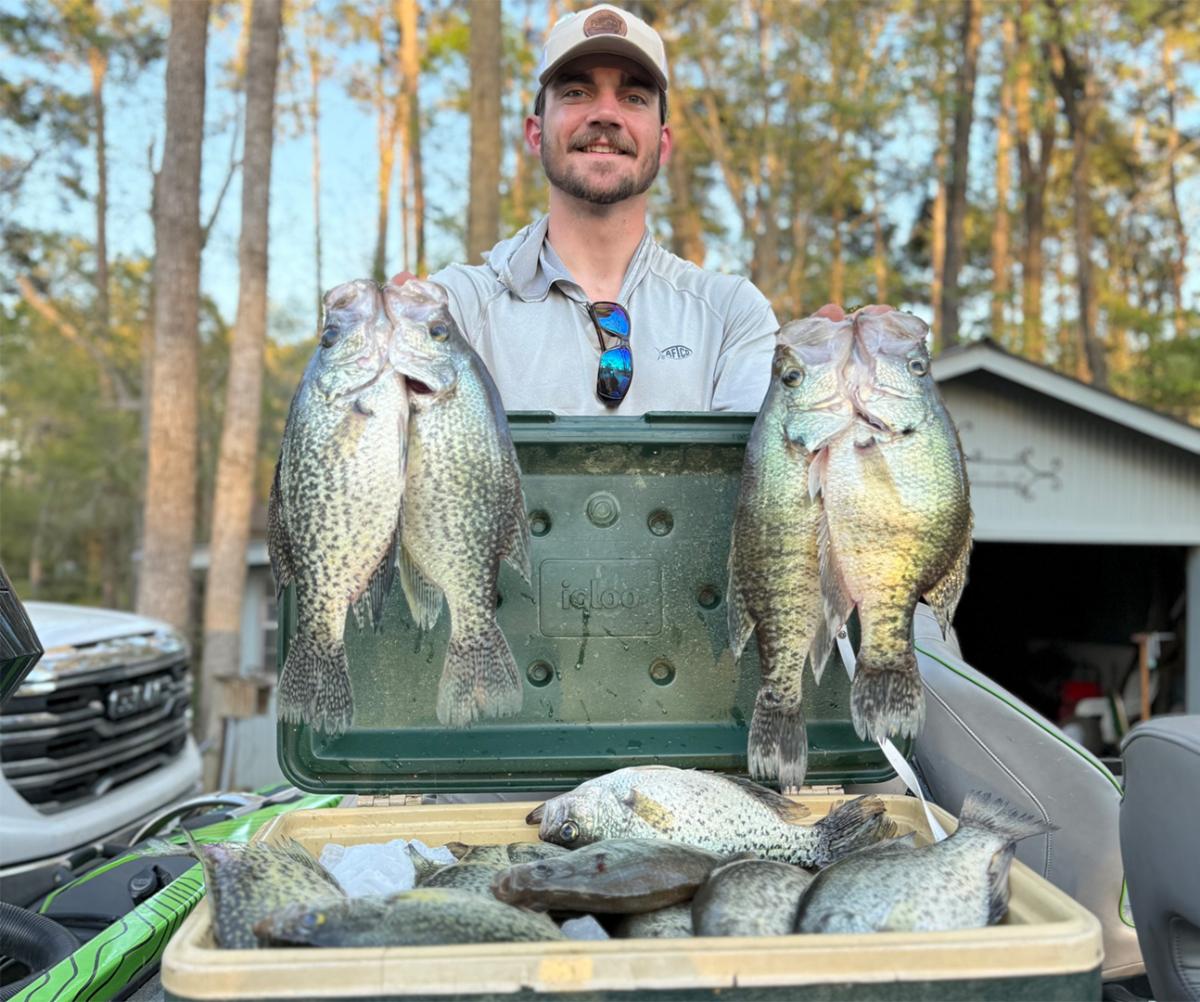
Interesting deal! Begs the question – should we fish more "camo" colors? Especially for clear-water black crappie?
Just like those smallmouth Dan is talking about, black crappie can get real finicky, so why not start fishing colors that "blend in" with the water a little more?
Maybe throwing baits that the crappie feel like they've found could be a game-changer when you're on those big groups of fish that just won't bite? Something to think about anyhow.
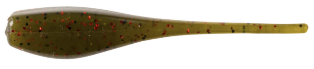
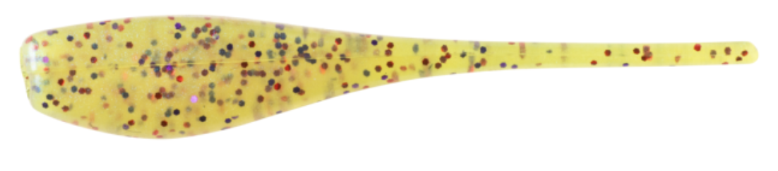
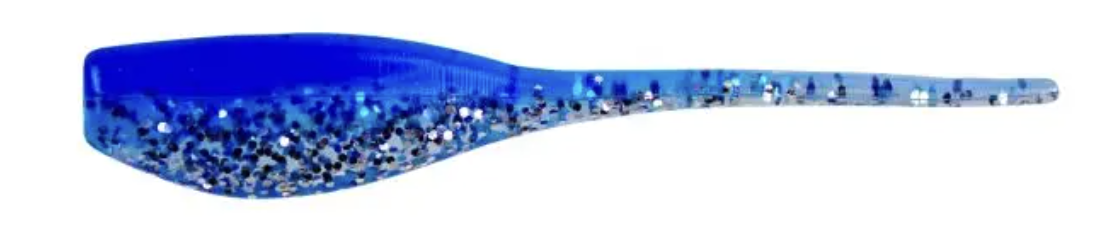
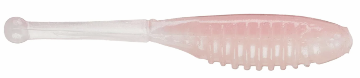
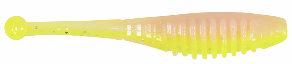
This whole deal made me think of all the sick colors the Bobby Garland Baby Shad has that could blend in with your water – here are a few:
'Outbreak'
|